on this branding project, we had the privilege of working with Menos Waste, a sustainable refill shop committed to promoting sustainable living and reducing waste. Our role was to help them establish a brand identity that would effectively convey their mission, values, and goals to their target audience.
branding for a more sustainable alternative.
To begin the project, we conducted a brand discovery process to better understand Menos Waste's vision, target audience, and competition. Through in-depth research and analysis, we were able to identify key elements that would inform the design of their brand identity. These included the brand's name, tagline, color palette, typography, and visual language.
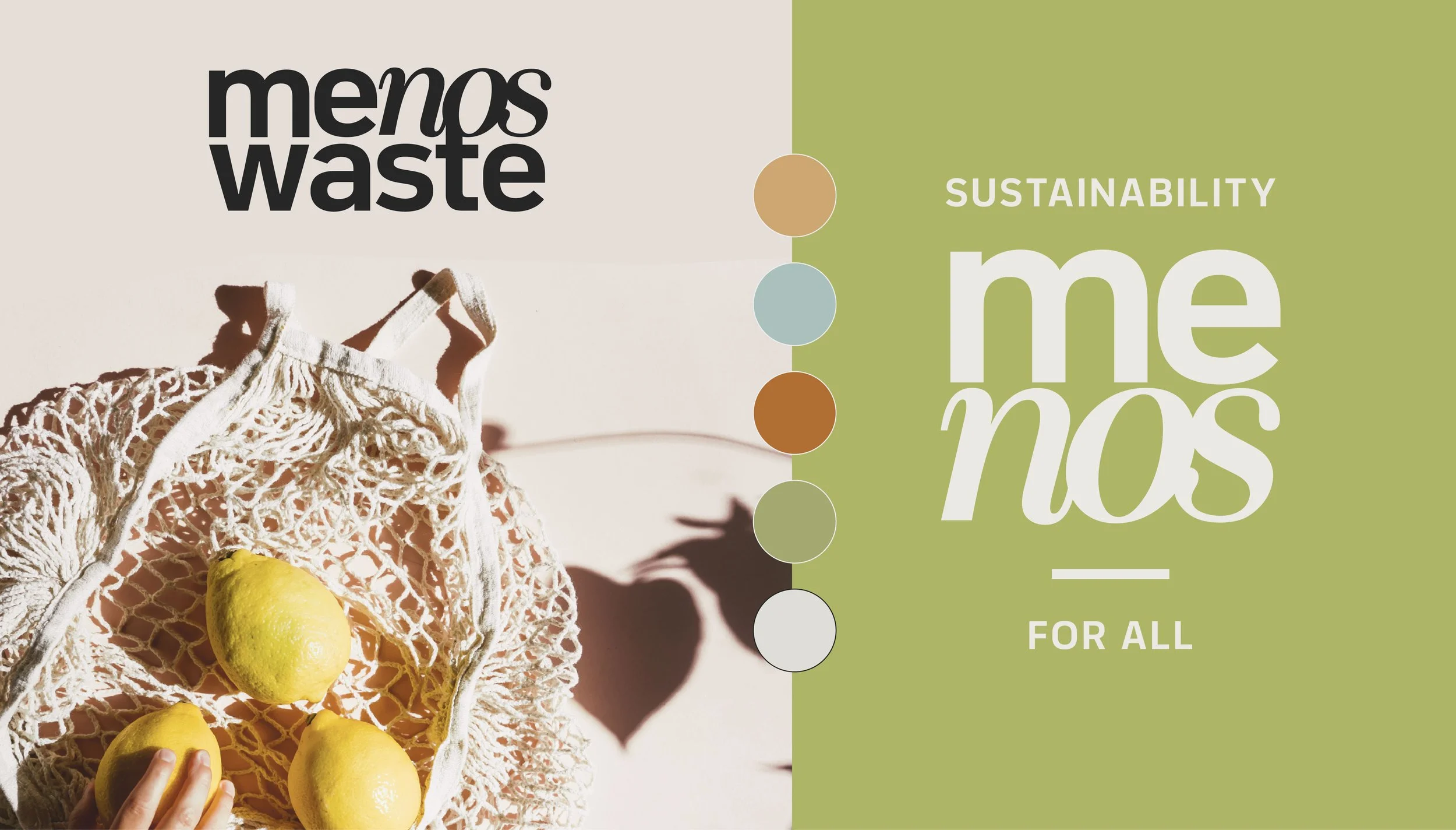
After completing the brand discovery process, we developed several design concepts that reflected Menos Waste's mission and values. The final design concept selected by Menos Waste incorporated earthy colors and clean shapes to convey the idea of sustainability and environmentalism.
The logo design was inspired by the concept of “me” and “we” - menos, in spanish - means less. less waste. however, when you take the word apart, it resembles “me” as in myself, an individual. and “nos”, nosotros, “we” - it symbolizes how the actions of an individual, no matter how small or big, can leave a bigger impact. the color palette featured shades of green and blue to represent nature and the environment.
Overall, our work on the Menos Waste project was focused on creating a brand identity that reflected the company's values and mission. Through careful research and design, we were able to develop a brand identity that successfully conveys Menos Waste's commitment to sustainability and reducing waste.


