UNCHARTED is a sustainable coffee brand owned by two black sisters who wanted to create a luxurious coffee experience that aligned with the quality of their product. As the branding designer, i collaborated with rebel hq and my goal was to create a visual identity and packaging design that was out of the box and catered specifically to their target audience.
uncharted: decolonized coffee.
Before starting the design process, I conducted research on the coffee industry, particularly on branding for luxury coffee products. I also researched the market for black-owned businesses catering to black women, to better understand their target audience.
I discovered that the coffee industry is highly competitive, with many brands using traditional coffee imagery and branding. However, I also found a growing trend towards more luxurious and sustainable coffee products, which aligned well with UNCHARTED's values.
In my research on the target audience, I found that black women are a demographic that is often overlooked by mainstream brands. However, there is a growing market for black-owned businesses catering specifically to black women, with an emphasis on luxury and quality.
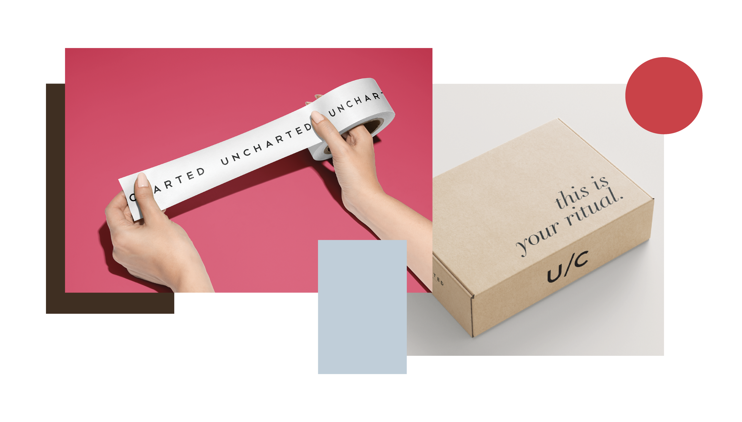
The color palette for UNCHARTED was chosen to convey a sense of luxury and sophistication, while also incorporating elements of the natural world. The colors used in the branding were colors in nature: light blue, brown. we wanted to portray a level of femininity and boldness in the palette, so we included hot pink, as well.
The light blue color was chosen to represent trust. This color is also associated with the ocean, which ties into the exploration and adventure theme that was initially considered for the branding.
The brown color represents the natural, earthy qualities of coffee. It is also associated with warmth and comfort, which ties into the idea of creating a luxurious coffee experience.
The hot pink color was chosen to add a pop of color and energy to the branding. This color is often associated with femininity, which was important for us to portray, but it was used in a bold and vibrant way to break away from traditional gendered color associations.
the branding for UNCHARTED was created to reflect the luxury and quality of their sustainable coffee product and to cater to their target audience of black women. The final branding package includes a primary logo, color palette, typography, packaging design, and custom subscription box design. the goal in the packaging design was to tell these women’s stories to their audience. in our discovery call, we reflected deeply on the idea behind selling more than just a “product” - we wanted to build community, and we wanted our audience to connect to the story of these two beautiful sisters.


